Our Web Design Process: From Discovery to Launch
Written by Gabriel Bertolo
July 20, 2026
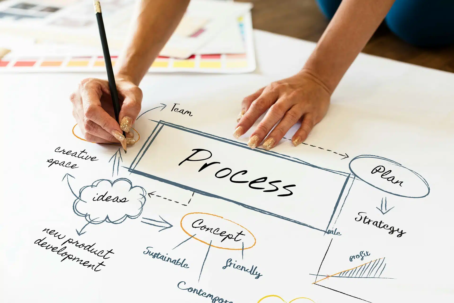
You go through the daunting process of reaching out to different web designers, getting quotes, and deciding who to hire. You pay the retainer invoice and sign the contract. Then what?
When web design projects fail, the culprit is usually not bad design. It’s a bad process. Every web design company has its own, and it varies depending on the price point. Cheap designers typically don’t do real onboarding or discovery, so I’m going to leave the sub $5k web designers out of the rest of this conversation.
Even in the professional pricing tiers, the process varies wildly. Most agencies are vague about how they run discovery. And I’ve seen some genuinely rough ones over the years. Discovery is where the whole project is won or lost. The more a design strategist knows about who you are, what you offer, and who you’re selling to, the better the result.
It’s a fine line though. Business owners don’t have time for endless meetings and a drawn-out discovery that starts to feel more like therapy than web design.
83% of web design projects that include a discovery phase succeed, compared to only 52% of the ones that skip it.
And that difference isn’t talent. It’s methodology.
Without a clear process and established expectations, things go sideways in predictable ways. Here are the industry averages:
It’s a story I hear constantly, and around here it stings a little more. The Pioneer Valley runs on small, independent businesses. The family restaurant that’s been on the same block for thirty years, the maker who sells at the Northampton farmers market, the shop owner who knows regulars by name. These are people who count every dollar and can’t shrug off a five-figure mistake the way a national chain can. So when one of them tells me they were quoted $20k and two months, then watched it launch five months late, riddled with bugs, at a final cost of $30k, it isn’t an abstract industry statistic. It’s a neighbor who got burned.
That’s not a design issue. It’s not that they lied to you, hopefully. It’s a bad process. Like anything else, the preparation and the planning are what make the whole thing flow.
Over my 13+ years running Radiant Elephant, I’ve built a multi-phase onboarding and discovery process that stays smooth and detailed without eating up the client’s time. It’s the thing that keeps projects from falling apart.
Fewer meetings mean more billable hours go into the actual work.
Detailed pre-contract scope questions mean the timeframe and the quote are accurate.
Clear expectations for both sides.
I’ll walk through each phase, why it matters, what happens when it gets skipped, and how it leads to a better website and a better experience for you.
You’ll see why a good discovery process prevents expensive mid-project changes, and how a strategy-first approach leads to lower long-term costs.
Over the years I’ve learned an enormous amount from clients who came to us from other agencies. I’ve heard about their experiences with small local shops and with some of the biggest web design companies in the country. Every one of those stories taught me something, and I’ve folded all of it back into refining how we do this.
Discovery is where most agencies cut corners.
When I was younger, I painted houses for extra cash. Interior work is funny. The first two or three days are almost entirely taping, laying down plastic, and prepping. Barely any paint touches the wall at first.
But the better the prep, the better the paint job. It holds up as an analogy for web design. The better we prepare, the better the result you get. Discovery is the highest-ROI phase in the whole project because it lays the groundwork for everything that follows, and it’s the single biggest factor in whether a project succeeds.
The time discovery takes varies, of course. A Northampton website design for a small local business is going to be a lot shorter than a national e-commerce build. But every project benefits from some version of it.
Aligns business goals: As the strategist, I need to understand what success actually looks like to you. Is it more leads? More sales? Brand awareness? Is there a specific part of your company you’re trying to scale? Different goals call for different design strategies. The web design company and the client have to be completely aligned on where we’re headed.
Audience research: Who are you actually selling to? Which segments drive the most growth? What are their pain points? What earns their trust? Successful websites don’t try to speak to everyone. Understanding your users is the whole game when it comes to conversion.
Competitive analysis: What are your top competitors doing well? Where are the gaps we can move into? This is how we find your strategic position in the market rather than building another lookalike site.
Technical audit: For redesigns, I dig into what the current site does well and where it’s failing. I look at conversion rates, bounce rates, and user behavior to understand how people are actually engaging with what you have now.
Content strategy: What content do you already have, and what do you still need? Who’s writing it? Content is almost always the biggest bottleneck in a project, so we sort it out early. It’s also a conversation I start during the pre-contract phase, before anyone signs anything.
Success metrics: Every business is different, so knowing your most meaningful KPIs up front matters. It’s how we measure whether the project worked. Did the new site lift traffic, conversions, and revenue? We set those benchmarks in discovery so the entire design strategy is built to hit them. That’s what protects your ROI.
Scope creep: Without a crystal-clear understanding of scope, things spiral fast. Those “one more thing” emails from various stakeholders halfway through the build lead to wasted time and blown budgets. Nobody enjoys it. Discovery keeps it contained.
Design misalignment: This one happens constantly. The agency assumes it knows what the client wants. The client assumes the agency gets it. The project nears the finish line, the client finally sees the site, and their stomach drops because it’s not what they pictured at all. Now you need a full redesign, and weeks are gone.
Going over budget: It costs far more to fix things after launch than during design, and even more once you’re in the maintenance phase. Discovery is where those problems are cheap and easy to solve.
I had a client come to us a while back who had paid a well-known web design company $30k for a redesign. By the time she called me, she sounded worn down. Not angry exactly, more defeated, the way you get when you’ve spent serious money and feel like nobody on the other end is actually hearing you. She told me that every conversation with the agency felt like a fight just to be understood on her own project, on her own brand. And what they eventually handed her was this stiff, corporate website that felt nothing like the warm, personal business she’d spent fifteen years building. Her customers noticed. Conversions dropped. Revenue followed them down. The hardest part to sit with is that all of it was preventable. A single honest discovery conversation at the start would have caught the mismatch before a line of code was written. Instead she paid $30k to feel unheard, then paid again to have it fixed. I’ve seen this exact pattern enough times that I can almost feel it coming in the first phone call, and it’s the reason I’m borderline obsessive about discovery.
Wireframing separates the pros from the amateurs.
Layouts aren’t there to look cool or to decorate. There are established UX and conversion rate optimization principles that dictate how information should be presented, and the order and flow of a page have a profound effect on how it converts. Wireframing is also where we solve the strategic and structural problems before any visual design gets layered on top. At its core, wireframing is about user experience.
Site architecture: How should the pages be organized? What’s the hierarchy, and what journey are we guiding the user through? How clear is the navigation? This is foundational, and no amount of beautiful design can paper over a broken structure underneath.
Content hierarchy: What are the most important elements on each page? What does a visitor need to see and understand the instant they land? Which elements actually drive the conversion? Getting this order right is a big deal.
User flows: How do people move through the site? Where do they enter? Where do they convert? The better we understand this, the better we can structure the site so users find what they need faster and convert more often.
Mobile vs. desktop: People behave differently on different devices. I always pull the Google Analytics data to see the percentage of visits from each device type, so we optimize for the reality of how your audience browses and prioritize the device most of them use. We design mobile-first, always.
Changing something in a wireframe is quick and cheap. The further into the build you get, the more expensive every change becomes. For larger projects, we present the site as an interactive wireframe built directly in WordPress rather than bouncing between Figma and the platform. It streamlines the whole thing and lets us test and debug while we design.
Now that the strategy is locked, the user journey is mapped and validated, and the content hierarchy is approved, we get to the part everyone looks forward to: visual design. But this isn’t art for art’s sake. Every single design choice is made in service of the strategy.
Brand expression: Visual design is where your brand’s personality comes through. Are you quirky? Innovative? Laid back? Luxury? The colors, the typography, the imagery, the white space, all of it works together to communicate who you are.
Conversion psychology: Design directs attention. Contrast creates focus. White space gives the eye room to breathe. Color shapes emotion. Even button size affects click-throughs. Every choice is deliberate and tied to the strategy, using conversion rate optimization and UX best practices.
Visual hierarchy: We make sure the most important information and conversion elements are large, bold, and impossible to miss. Supporting elements stay secondary. The whole point is to guide the eye down the conversion path.
Mobile-first design: Over 60% of web traffic comes from mobile devices. We design the mobile layout first, then scale up to tablet and desktop. That way your mobile experience is genuinely optimized for conversions instead of being an afterthought squeezed down from a desktop layout.
Accessibility: Good design has to work for people with disabilities. Proper color contrast helps readability. We write descriptive alt text for images. We build in keyboard navigation. People with disabilities make up about 16% of the population, and they’re your customers too.
Design system creation: We build reusable components for consistency, including buttons, cards, forms, and more. It also makes future updates far faster and easier for you.
Presentation: We present designs with the reasoning attached. We walk you through the thinking behind each choice and how it ties back to your goals, so you’re never guessing why something looks the way it does.
Revision rounds: Usually two to three, depending on the project. Round one is about overall direction. Round two is refinement. Round three is final polish. We use structured feedback tools so revisions stay organized and easy to implement.
Design QA: Before anything is handed off to development, we QA the designs themselves. Every state gets designed (hover, active, error). Every mobile layout is complete. Loading states are handled. Catching these things in the design phase prevents costly changes later in development.
Phase 4 is where design meets function.
Clean code: We write clean code and only use frameworks that output clean HTML, CSS, and JavaScript without bloat. Clean code is easier to maintain, and the next developer who touches it will have a far easier time.
Performance optimization: We build for speed. We optimize every image, keep JavaScript minimal, and use fast hosting. Our target is a load time under two seconds, because sites that take longer than that can lose up to 60% of their visitors before the page even finishes loading.
CMS integration: We typically use WordPress configured to your specific needs, with custom fields for easy content updates and training so you can make small changes yourself.
SEO foundation: We build advanced on-page SEO into every site. Clean URLs, proper heading architecture, meta descriptions written to rank and earn clicks, advanced schema markup, sitemaps, and more. These are the technical foundations that help the site show up in search.
Security: Security isn’t an afterthought. Every site we build ships with SSL, a hardened WordPress configuration, two-factor authentication, automated backups, and active monitoring. A breach doesn’t just knock your site offline. It can damage your reputation and erode customer trust in ways that are painfully hard to win back.
Responsive execution: Every element is built and tested across screen sizes, not just glanced at in a browser’s responsive preview. Real devices behave differently from simulated ones, so we build and test on actual phones and tablets.
Most agencies vanish into a black box during development. The client sees nothing for weeks, then gets a big “reveal” where they’re expected to approve an entire site in a single meeting. That’s a setup for failure. Problems get buried, wrong assumptions never get caught, and you end up in expensive revision rounds.
We build in sections instead. Homepage first. Then the about page. Then services. This lets you preview real functionality, not just static designs, and give feedback on interactions and animations before the full build is committed. Issues surface early, when they’re cheap to fix.
Weekly progress updates: You get access to the staging site throughout the build and see progress in real time. It keeps you engaged and eliminates the surprise-reveal moment that nobody actually wants.
Version control: We use Git on every project. Every change is tracked and can be rolled back if needed. This is standard in professional development. If an agency you’re talking to doesn’t use version control, treat it as a red flag.
This is where amateur agencies fall apart. They “test” by clicking around for twenty minutes and then launch. QA isn’t perfectionism. It’s basic project economics.
A bug caught during QA costs a fraction of what the same bug costs after launch. A bug found months later can cost 100 times more to fix, especially if the original developer has moved on. Keep that in mind the next time an agency tells you they trimmed QA to speed up the timeline.
88% of users won’t return to a site after a bad experience, and 60% of production bugs come from untested code. One missed bug means lost customers, lost revenue, and a dented reputation. QA is what prevents it.
Functionality testing: Every feature works as designed. Forms submit. Links work. Buttons do what they should. Navigation functions. Search returns results. It sounds basic, but 52% of websites launch with broken links. We check every one.
Cross-browser testing: Your site has to work on Chrome, Firefox, Safari, and Edge. Different browsers render code differently, sometimes significantly. We test on real browsers and catch the inconsistencies before your visitors do.
Responsive testing: We test on real devices: iPhone, Android, tablets, desktops. A browser’s “responsive mode” is not the same as real hardware. We catch touch-target sizing, text readability, and layout breaks that only show up on the actual device.
Performance testing: Is load time under two seconds? Are Core Web Vitals passing? Images optimized? Code minified? Caching configured? Performance is directly tied to conversions and rankings, so it’s not optional.
Accessibility testing: Does keyboard navigation work? Do screen readers function? Is color contrast sufficient? Are ARIA labels present? Accessibility is legally required in many cases and good practice in all of them.
SEO testing: Proper heading hierarchy? Meta tags present? Image alt text complete? Schema installed? XML sitemap generated? Analytics tracking correctly? We verify all of it before launch.
Security testing: HTTPS working? Spam protection on forms? User roles configured correctly? Backups automated? Security plugins active? We run the full checklist.
Content proofing: Spelling checked. Grammar reviewed. Phone numbers correct. Email addresses working. The team photos are actually your team. This sounds trivial right up until a site launches with the wrong phone number and the client spends a week wondering why the calls stopped.
Here’s the real math. A bug caught in QA takes an hour or two to fix, usually around $200. That same bug caught a week after launch means context switching, reproducing the issue, deploying a patch, and re-testing, and now you’re at $800. Catch it three months later and you could be looking at $2,000 or more, especially if the original developer is gone and the codebase feels foreign again.
And that’s before the business cost. Launch with broken forms and your leads never arrive. Launch with slow load times and 60% of visitors bounce before they see your offer. Launch with a security hole and you’re exposed to liability. Those costs make the QA investment look trivial.
We use structured QA checklists with over 100 items and test on real devices. We also run “bug bash” sessions where team members from different roles test the site, because fresh eyes catch what the developer’s eyes have gone blind to. Some agencies test by clicking around for twenty minutes. We put 40 to 60 hours into comprehensive QA, because fixing bugs before launch is five times cheaper than after.
Before launch, you test the site yourself. We hand you a testing checklist and a structured feedback tool. This catches content errors (you know your business better than we ever will), missing functionality, and user-flow issues that only become obvious when someone new is navigating the site.
Clients who engage in UAT find 25 to 30% more issues than developer testing alone. That’s not a problem. That’s the system working exactly as intended. Far better to find it now than after launch.
Nobody wants to talk about content migration. It isn’t exciting. But it’s one of the places where projects most often stall, and where agencies that don’t plan for it do real SEO damage to their clients.
If you have 200 blog posts, 50 pages, and hundreds of images on your old site, all of it has to move. Content needs updating. URLs need mapping. Redirects need configuring. None of it happens on its own.
Content doesn’t migrate itself: Someone has to move those posts, optimize the images, and reformat everything for the new layouts. If it isn’t budgeted into the project, your launch date slips. We plan for it from day one.
URL mapping & redirects: Every old URL has to redirect to its corresponding new one, or you lose the SEO equity you’ve spent years building. We map every page, configure 301 redirects, and test each one. Miss this and Google treats your new site as brand new, which means lost rankings and lost traffic, sometimes overnight.
SEO preservation: Your old site has years of SEO value baked into it. We protect that equity with proper redirects, retained URL structure where possible, metadata migration, and schema. I’ve seen agencies launch a redesign that dropped 40% of the client’s organic traffic because they botched the redirects. Our checklist-driven migration is built specifically to prevent that, and it’s the same discipline behind the redesign-recovery work we do for clients who come to us after exactly that kind of disaster.
Content updates: While we migrate, we update stale content. Old team members come off. Prices get corrected. Photos get refreshed. It’s the best opportunity you’ll have to improve the content while it’s already in motion.
Analytics setup: We install Google Analytics 4, configure conversion tracking, set up goal tracking, build a dashboard, and connect Search Console. We test all of it before launch, because launching without verified analytics is flying blind from the first day.
Timeline reality: Migration takes one to two weeks for a 50-page site and up to three weeks for a 500-page site. If your agency isn’t accounting for that, the timeline they gave you isn’t real.
Launch is exciting. It’s also where things can go badly wrong if the process isn’t planned with care. A lot of agencies treat launch like a finish line. We treat it like a precision operation with real timing involved.
Final QA pass: We re-test everything one more time. Forms. Links. Functionality. Responsive behavior. Performance. Things can break during final updates, and we want to know before your visitors do.
Backup old site: A full backup of the existing site before we touch anything. If something unexpected happens, we roll back. That backup is peace of mind for everyone.
DNS & hosting: Hosting confirmed and ready. DNS records prepared. SSL installed. Caching configured. We make DNS changes during low-traffic hours, usually 2 to 4 am, to keep disruption to a minimum.
Monitoring setup: Error monitoring installed. Uptime monitoring configured. Analytics verified. We need to know the instant something breaks, not two days later when you email us.
Stakeholder communication: Your team knows the site is going live. Everyone’s prepared for the brief transition window. A developer is on standby for the first 24 hours.
DNS propagation: When DNS records change, it takes 24 to 48 hours to propagate globally. During that window, some visitors see the new site and some see the old one. It’s completely normal, but you should know to expect it so nobody panics.
Immediate monitoring: We watch error logs, contact form submissions, site speed, and overall functionality through the first few hours. That window is critical.
Browser cache issues: Clients often see a cached version of the old site right after launch and think nothing changed. We give you clear instructions for clearing your cache before you start testing.
Quick fixes: Minor issues at launch are normal. A broken link here, a typo there. We fix them fast, and we hold a 24 to 48-hour support window right after launch specifically for this.
Our launch timing is intentional. We go live Tuesday or Wednesday mornings between 9 and 11 am. Why? The developer is fully available if anything comes up. We avoid Monday (too chaotic), Friday (a fix might have to wait until Monday), and weekends (no support coverage). It sounds like a small detail. It isn’t.
Most agencies disappear after launch. We don’t. Launch is the beginning, not the end. The first few weeks live are when you learn the most about how real people actually use the site, and that data is far too valuable to ignore.
Monitoring & fixes: We watch site performance, user behavior, and error logs. The first two weeks reveal things QA occasionally misses, and we fix them fast while the build is still fresh.
Content updates: Clients often realize after launch that they want to tweak something: a headline, a service description, a team bio. We’re available for quick updates while it’s all still top of mind.
Training: We train your team on the CMS. How to update pages, add posts, swap images, change copy. We record video tutorials for reference so you’re never dependent on us for the small stuff.
Analytics review: We confirm all tracking is firing correctly. Goals working. Data accurate. Any tracking issue gets caught and fixed quickly.
Performance tuning: Now we have real user data instead of assumptions. Which pages load slowly? Where are people bouncing? We optimize based on actual behavior.
SEO monitoring: We check rankings, monitor traffic, confirm the redirects did their job, and watch for 404s. The first 60 to 90 days after a redesign are critical for SEO continuity.
Conversion optimization: We review the behavior flows. Where do people drop off? Which forms aren’t converting? Which calls to action aren’t getting clicked? Then we make data-driven improvements built on what the launch actually showed us.
Iterate: A website is never truly finished. Launch is version 1.0. The goal is to keep measuring and improving over time. The agencies that understand this are the ones clients stay with for years.
After the initial engagement, we offer maintenance plans covering monthly updates, security patches, content changes, and technical support. We also offer ongoing SEO, conversion optimization, A/B testing, and content creation.
We hold a 98.5% client retention rate because we don’t vanish after launch. We’re invested in your long-term success, not just in shipping the project. The site we launch is version 1.0. We help you get to 2.0, 3.0, and 4.0 as your business grows.
After 13+ years and dozens of successful projects, here’s what I’ve learned actually separates the agencies that consistently deliver from the ones that leave clients frustrated and over budget.
Transparency: You know exactly what’s happening and when. No black boxes, no surprises. You have access to the staging environment throughout the build and get weekly status updates. There’s never a moment where you’re left wondering what you paid for.
Client involvement: You’re not a passive buyer, you’re a collaborator. Your input shapes strategy, design, and content. But you’re not project-managing the build. We steer the process. Your job is to give feedback at the right moments, not to manage tasks.
Methodology over improvisation: We follow a proven process rather than figuring it out as we go. Every phase exists because I’ve seen firsthand what happens when it gets skipped. It isn’t rigid. It’s disciplined.
Quality standards: We don’t cut corners. Thorough discovery. Strategic wireframes. Comprehensive QA. A proper launch. These phases aren’t optional add-ons. They’re how we prevent the expensive failures that plague web projects across the industry.
Owner-led service: I personally handle strategy and oversee every project. It doesn’t get handed off to a junior team member. When you work with Radiant Elephant, your investment gets senior-level attention from start to finish.
Accountability: When I quote you a timeline, I’ve already pressure-tested it against the pre-contract scope questions, so it’s a real number, not a hopeful one. And on the rare occasion something slips or breaks on our end, you hear it from me directly, along with the fix and the new date, before you have to ask. The thing most people are really buying when they hire an agency is the confidence that someone will own the outcome. That’s the part I refuse to outsource.
Long-term partnership: Our 98.5% retention rate is the proof. We’re your web partner, not a vendor you hire once and never hear from again. In fact, our very first client from back in 2012 is still with us today. Over those years we’ve built them five different websites as their business has grown and changed.
When you’re evaluating agencies, these are the questions that reveal how seriously they take process: Do they run real discovery, or jump straight to design? Do they show wireframes, or only finished visuals? How many hours of QA do they budget? What’s their launch process? What happens after launch? What’s their client retention rate? The answers tell you everything you need to know.
Process isn’t bureaucracy. It’s how we deliver websites that actually work, on time, on budget, with minimal stress and maximum results.
Agencies that “move fast” usually mean they skip the phases that matter. Fast discovery means missed strategy. Fast design means generic templates. Fast QA means buggy launches. Fast looks appealing right up until your project turns into a $30k mistake and you’re starting over.
Good websites take 12 to 18 weeks for a reason. Each phase prevents a specific, predictable failure. Cut corners, and you pay for it later in missed deadlines, budget overruns, post-launch fixes, and weak performance.
We follow this process because it works. 13+ years. Dozens of successful launches. A 98.5% retention rate. Clients stay because we deliver predictable, quality results. The process is the reason.
Ready to start? We offer paid discovery phases, typically $3,000 to $5,000, that clarify your strategy, define your requirements, and produce a full roadmap. Whether you go on to build with us or not, the discovery document is yours to keep.
Prefer to jump straight into a full project? We’ll walk you through exactly what the next 14 to 18 weeks look like, what we need from you, and how we’ll work together. Total transparency from proposal to launch.
The process we follow isn’t magic. It’s discipline. Every phase exists because I’ve seen what happens when it’s skipped. When you work with Radiant Elephant, you’re not just getting a website. You’re getting a proven methodology that protects your investment.

Gabriel Bertolo is a 3rd generation entrepreneur who founded Radiant Elephant over 13 years ago after working for various advertising and marketing agencies.
He is also an award-winning Jazz/Funk drummer and composer, as well as a visual artist.
His Web Design, SEO, and Marketing insights have been quoted in Forbes, Business Insider, Hubspot, Entrepreneur, Shopify, MECLABS, and more.
Check out some publications he's been quoted in:
Quoted in HubSpot's AI Search Visibility Article and HubSpot's Article on 6 Best Wix Alternatives
Quoted in DesignRush Dental Marketing Guide
Quoted in MECLABS
Quoted in DataBox Website Optimization Article and DataBox Best SEO Blogs
Quoted in Seoptimer
Quoted in Shopify Blog